It may be useful to include landing pages in your marketing campaigns. For instance, do you have a temporary promotional campaign that customers can subscribe to? Or do you want someone who has clicked on a link in an e-mail to be taken to a landing page with more information? This can be arranged with our Pages in Deployteq. Here you can easily create subscription forms, surveys, or even mini websites outside of your own website.
There is always a default template available for Pages in Deployteq. With new brands, this can be found under ‘Default Pages’ in your file manager. Here, you’ll also find a couple of pages that have already been created so that you can see how certain objects and settings are used. The default template is fully responsive and has been created using the Bootstrap Framework. If your website has also been made using this framework, you can easily integrate your website’s styling into this. View the page on making a template to see what changes you need to make to completely tailor the template to your corporate style.
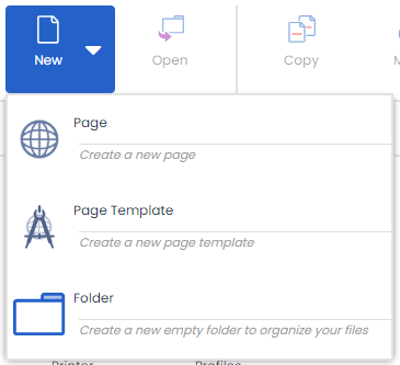
Creating a page
To start with a new page, go to the menu item 'Pages', then click on ‘New’ in the top right and choose the ‘Create a new page’ option.
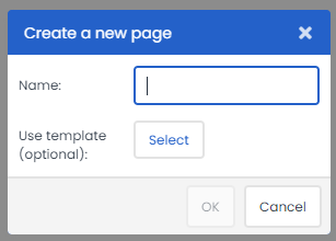
You will then see the option to enter a unique name and to choose the template you want to base this page on.
In the same way that you create an e-mail based on a template, you will see a library of objects on the right-hand side of your screen and can drag your chosen objects to where you want them on your page.
Formatting your page
You will probably want your page to be completely tailored to your corporate style or possibly want to create a new format for a temporary promotion. We have created a number of styling objects for this purpose to ensure that your page looks exactly as you want it. Use them to configure colours, fonts, sizes of objects, and rounded corners (‘border-radius’).
These styling objects all start with ‘0000’. The styling layout objects are:
- Styling: Default layout
- Styling Buttons: Default layout
- Styling: Errors Default layout
- Datepicker Script: Default layout
- Checkbox Radio Styling: Default layout
Configure the properties of your page style in the relevant object. For example, in ‘Styling: Default layout’ you can configure the following properties:
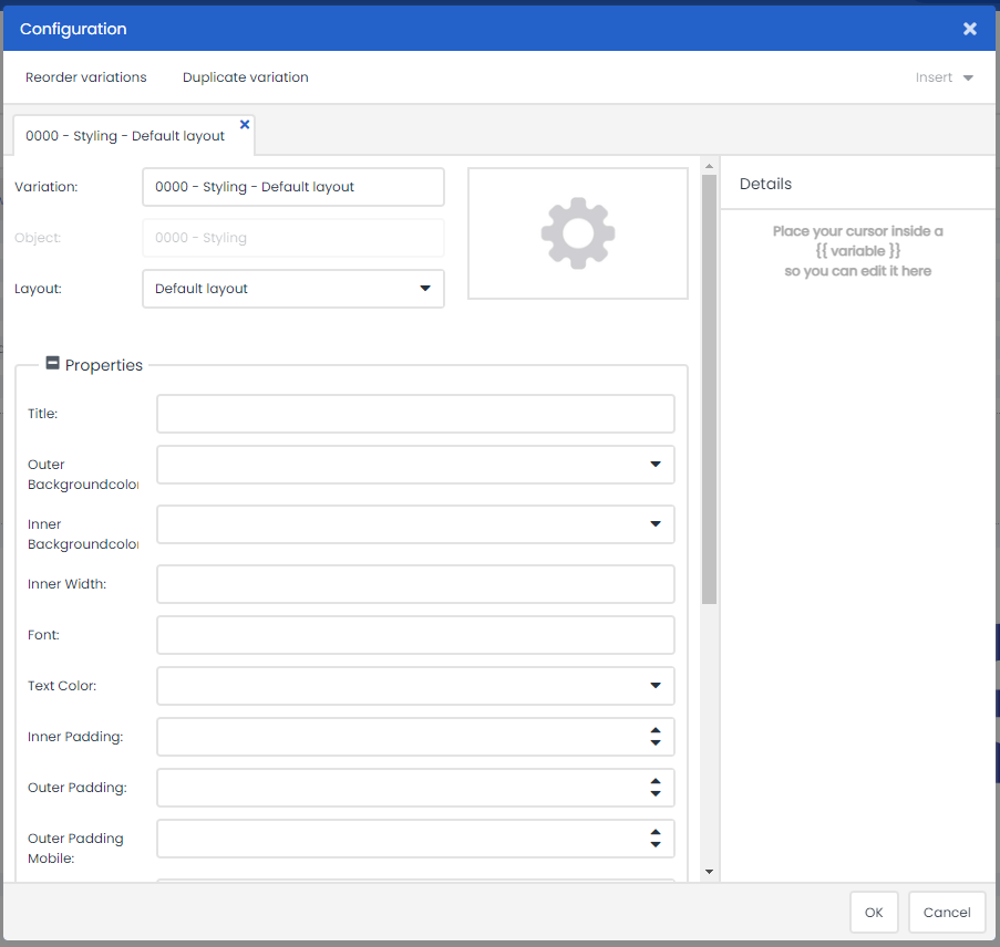
Above, you can see that you can give your page a title (which appears in your browser tab) and also configure the background colours, font, letter colour, and any rounded corners (‘Form Upper/Lower Border Radius’), etc.
In the settings where you configure the size, width, and height for properties (such as for fields, borders, and backgrounds), you can use percentage or numeric values. By adding a % sign after the value (as in ‘Inner Width’ shown above), this determines the dynamic relationship with the background. If you would prefer to configure a fixed relationship, you do not have to insert anything after the value, but you could add ‘PX’.
You can configure your preferred font in ‘Font:’. Enter the desired font with quotes, a space, and then ‘ms’, for example"comic sans ms"  .
.
If you make the grid lines visible by checking the ‘Show Grid’ checkbox (last setting of properties), this displays columns in your page example so that you can easily align your fields and content.
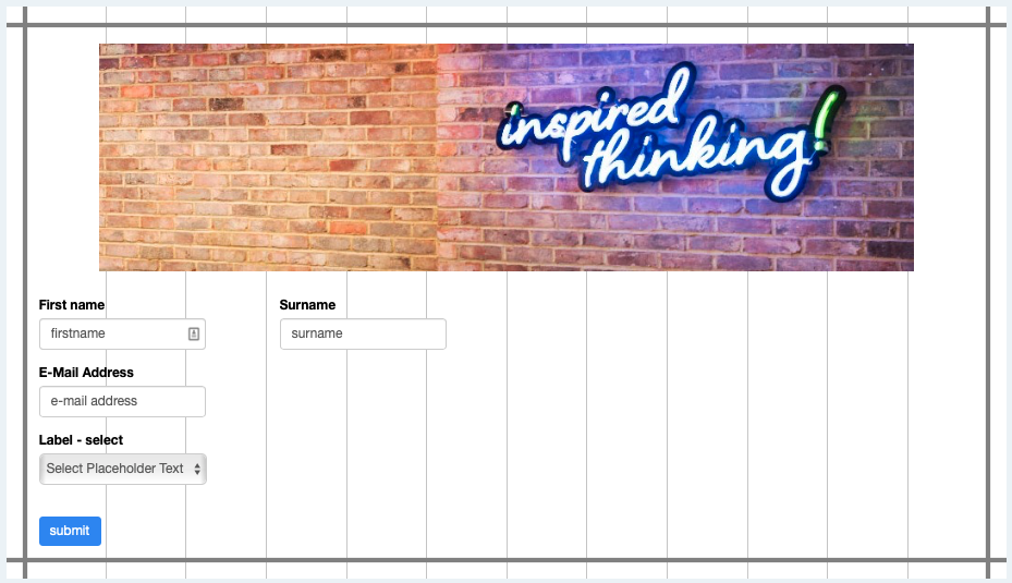
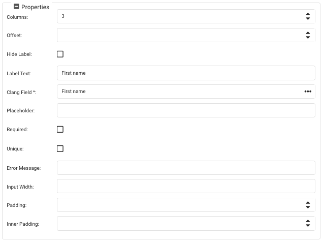
There are twelve columns in the default page. If you want to include two fields horizontally on a page, specify how many columns are to be used for each object. The above example shows a three-column view for the ‘First name’ and ‘Surname’ fields in the object properties.
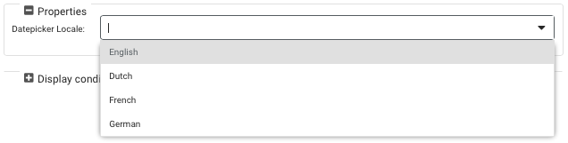
In the ‘Styling Buttons: Default Layout’, ‘Styling: Errors Default Layout’, and ‘Checkbox Radio Styling: Default Layout’ styling objects, you can configure your preferred properties for the (radio) buttons, checkboxes, and error messages in the page. In the ‘Datepicker Script: Default Layout’, you can configure the language setting for the Datepicker object in your page. You can choose from four different language settings.
Adding content to your page
Now that the style of your page has been configured, you can fill the page with content.
First of all, you have content blocks such as the header objects (e.g.‘0 - Title block’ and ‘0 - Title block with buttons’). Then you have text objects (e.g. ‘000 - Content (modern)’ and ‘000 - Divider’). Finally, you have the objects to create forms, such as inputs, radio buttons, and date pickers. These all start with ‘00’.
Header objects
Let’s start with the header and content objects, which give your page the layout and introduction that are needed.
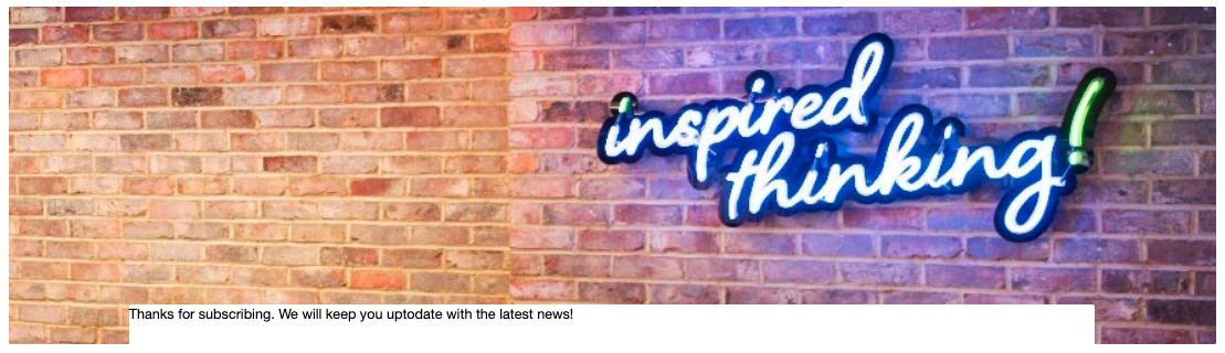
The header objects are large images with text on top and possibly a button. The header will extend across the width of the page and also take up the full width on mobile phones, albeit in a smaller version. In the object, you can once again use the gear icon to configure your settings. Start with the header and the text. Think about how you want to align them (left, right, or centred) and what you want them to contain. You can then add an image, or maybe just a background colour. You can also set a background colour if you do use an image, as this colour is displayed if the image is not loaded immediately. If you want white space to appear beneath the object, this can be configured with ‘margin bottom’ and you can also configure the rounded corners with ‘border radius’.
Content objects
Content objects have virtually the same settings. The only difference is that if you drag ‘000 - Content’ to your page, you will be able to choose from different layouts:
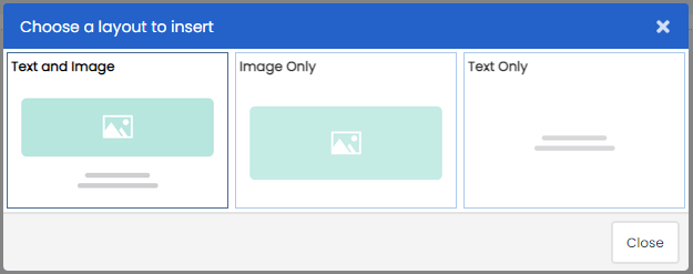
You can then determine how you want to arrange your text. If you want to place a text and image next to one another, use the ‘Image Only’ and ‘Text Only’ options. You can also make use of the twelve-column grid as explained above. If you want the objects in a 50/50 ratio, set the columns to 6 for both objects; for a 25/75 ratio, set the columns to 3 and 9. The image will automatically scale up or down to the space that is used.
The ‘000 - Content modern’ option produces an image that contains a text. Unlike the header object in which the text appears straight over the image, the text in this object appears in a text field across the image.
If you want to split up a page so that it is easier to read, you can include a line – or divider – in your page. Use the ‘000 - Spacer/divider’ object and choose from the following:
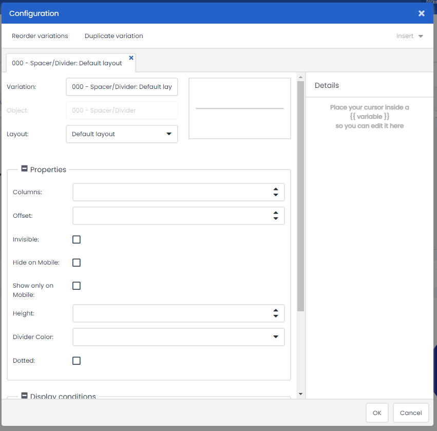
You can configure whether you want to fill the space with a line (and also configure whether the line should be dotted, and its thickness and colour) or whether there should only be an empty space. You can also determine whether or not the selected line should be visible on a mobile phone display.
Form objects
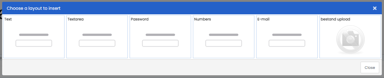
Text fields
We have also created various objects for you to create forms. There are different input fields you can use to request information. Choose the type of input field you want when you drag the object to the page. This determines, for example, which keyboard appears on the mobile phone, e.g. numeric keyboard or e-mail keyboard.
To configure an object, go through the properties of the object as shown in the example below for the ‘Input: E-mail’ object. The fields marked with an asterisk (*) are mandatory.
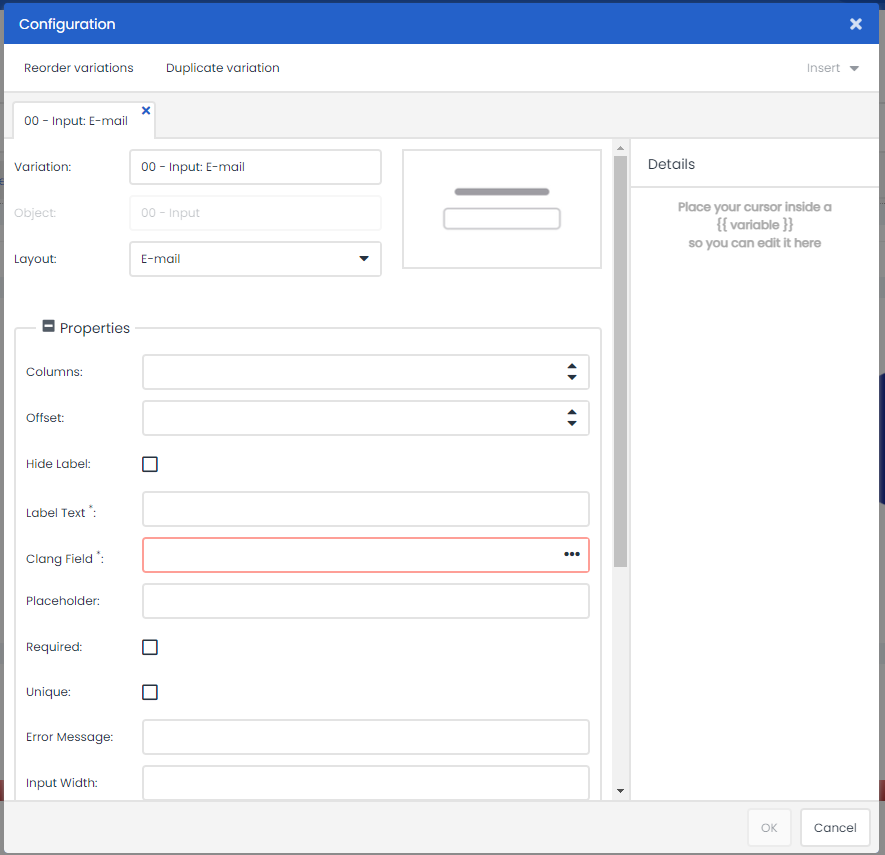
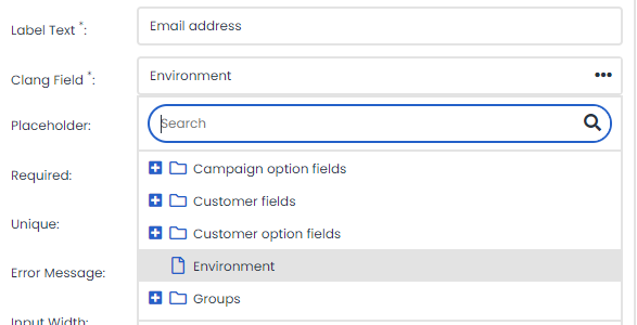
When configuring the ‘E-mail object’, specify a name for the field in ‘Label Text’. You then link the form field to one of the Deployteq fields, and choose one of the options below.
By inserting a value in ‘Placeholder’, you can display an example in the form. You can also use this as a label and then leave the label out. As mentioned earlier, if you have used the e-mail layout here, the e-mail keyboard will automatically be shown on mobile devices. The ‘@’ and ‘.com’ keys will then appear in the keyboard.
Tick the ‘Required’ checkbox to make the field mandatory and tick the ‘Unique’ checkbox to indicate that you want to base deduplication on this field. When an e-mail address is entered, as in this case, Deployteq will check whether this e-mail address already exists in Deployteq and will update or add a customer on this basis.
Selection fields
If you want to give your customers a choice, there are several objects available to display your choices to the customer.
- 00 - Checkbox
This gives the customer one choice, e.g. ‘I have read and accept the terms and conditions’ or ‘Yes, I would like to receive the newsletter’. - 00 - Checkboxes x6
This gives the customer six choices. It will only display the choices that are entered. You could also specify four choices only, or even ten if you place two of these objects underneath one another. This is useful if you want to ask your customers about their interests for instance. - 00 - Radio - Gender
This radio button is specifically used to select a gender. You can also display a third option, for people who do not want to specify a gender. The first field is selected by default. If you do not want this and want people to be able to leave this blank, choose the ‘No pre-select’ layout when dragging and dropping this object. This ensures that no radio button is selected when the page loads. - 00 - Radio - Custom
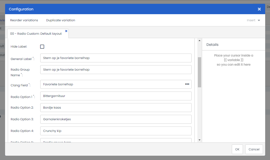
Here you can enter five of your own radio buttons, with only one choice possible. Any options not entered will not be displayed, which makes it possible to only display four. Again, you can opt for the ‘No pre-select’ layout so that none of the fields are selected when the page is loaded. Otherwise, the first choice will be selected when the page is loaded.
- 00 - Yes/No Radio
This instantly gives you a selection radio button with yes and no. You can add your own field and label to it. It could be used by someone, for example, to specify whether they will or will not be attending an event. - 00 - Selectbox
This gives you five choices that are displayed in a drop-down menu. Only one choice can be selected. This is virtually the same as the radio buttons but takes up less space.
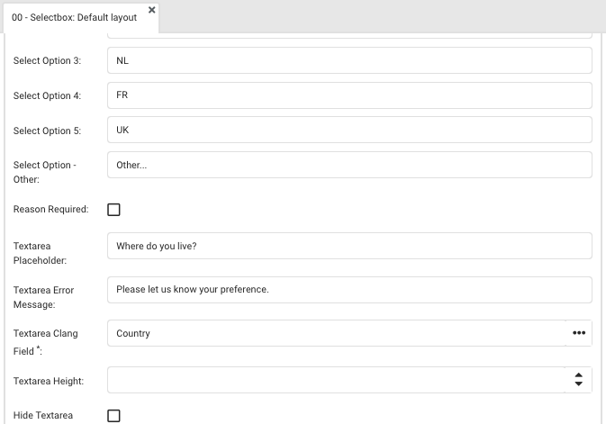
If a customer chooses the ‘Other’ value, this automatically displays a comments field in the page which the customer can use to provide an explanation. You could also configure this field with a placeholder, set it as mandatory (required), and link it to an existing Deployteq field (‘Textarea Deployteq Field’).
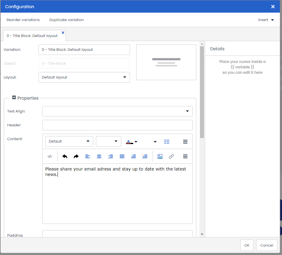
Creating variations
It is also possible to create variations for pages that are displayed when a customer fulfils certain conditions. As with e-mail templates, there are three buttons that you can use to duplicate, edit, or delete objects. If you duplicate an object, the copied object appears underneath. This is handy if you need several text input fields with the same settings, as you will only need to replace the labels.
You can also copy the same block as a variation. You can see in front of the name which version is shown in the example:
Go to the object for which you want to display several variations. It is often useful to fully complete this object first, as these are details that you modify in your variation. Then click on ‘Duplicate variation’ at the top to copy the block as an extra variation on this object.
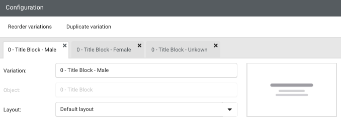
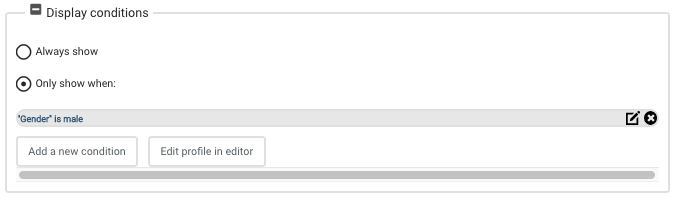
By changing the name in Variation, it is clear which variation contains what content. In the ‘Display conditions’ right at the bottom, you can set the conditions for displaying this variation. Deployteq reads the variations from left to right. If you always want something to be displayed, regardless of the conditions, choose ‘Always show’ in the last (furthest right) variation.
Once you have finished the page, you can use it in your campaign flows by using the 'Show page' object.
