Welcome back!
What's new in this week's release
- In the new design, there were some instances where text was being partially hidden on some buttons. This has been resolved.
- When comparing multiple reports in the new design, the names of the reports would overlap on the Opens/Clicks tab. This has been fixed by truncating the report name, and showing the full name when hovering over it.
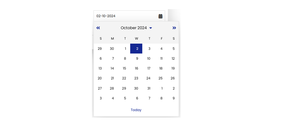
- The readability of the date picker has been improved in the new design by adding more color contrast. You can find the date picker in various places in Deployteq.
Quarterly Release Notes Overview
- Curious about what has been released in the past 3 months? Click here to for the Quarterly Release Notes overview for Q3!
Community News
Working with the Experts! On Wednesday, October 23, you have the opportunity to come work at our office for a day, right in the middle of our experts. This will be a great chance to ask questions or collaborate with others. There will, of course, also be an opportunity to network with other Deployteq users and exchange knowledge. You can read more about it here and sign up right away.
From previous conversations with various Deployteq users during the Roundtable Sessions, the wish for a series of informative webinars came up, covering several Deployteq-related topics, such as profiles, the use of Smarty, webhooks, or demonstrations of customer cases. In this survey (in Dutch), we would like to hear from you about what topics you would like to learn more about during these webinars.
In the Spotlight
Have you seen the new design yet? In this FAQ, you can read more about the new theme and what you really need to know!
We have already received valuable feedback from many of our customers in the Let's Talk Forum in the Community. Here, you can see what feedback other users have already provided or leave your own. If the topic you want to give feedback on isn't listed yet, you can create a new forum topic.
We wish you a great week!

