Dashboard

The first panel contains information about the mailing:
- Name: The name of the mailing as specified in the schedule.
- Status: The status of the mailing (Active, On hold, Done)
- Content: The name of the content. All content is displayed here in the case of a Split Run or Smart Run.
- Target group: The group or profile used for the broadcast.
- Start date: The time when the mailing was started. This may differ from the set date since data, such as records in the profile, still need to be collected when starting the mailing.
- End date: The time when the mailing was completed.
- Progress: This is displayed during the mailing broadcast. It indicates how many messages have already been sent.
- Speed: This is displayed during the mailing broadcast. It indicates the rate at which messages are sent.
- Estimated end time: The estimated end time is displayed during the mailing broadcast. This time is based on the start time, the progress, and the rate of the mailing.
- E-mail sent: The number of contacts that received the mailing.
- Accepted: The number of contacts that received the mailing minus the number of bounces.
- Bounces: The number of contacts from which the mailing bounced.
- Unsubscribes: The number of contacts that used the mailing to unsubscribe. This number is based on the number of contacts that have passed through an ‘Unsubscribe customer’ object.
- Complaints: The number of contacts that have marked this mailing as spam.
The bar underneath divides the target group into the following categories:
- Clicked: The percentage of contacts that have opened the e-mail and clicked in it.
- Opened, not clicked: The percentage of contacts that have opened the e-mail but not clicked in it.
- Accepted, not opened: The percentage of contacts that have received the e-mail but not yet opened it.
- Sent, not accepted: The percentage of the target group that has not received the sent e-mail (bounce).
- Part of selection, not sent: The percentage of the target group that has not been sent the e-mail (not mailable).
Three meters are dislayed in the panel on the right:
- Progress: This displays the progress of an ongoing mailing as a percentage (%).
- Accept ratio: This displays the percentage of sent e-mails that have arrived (number of accepted e-mails/number of sent e-mails).
- Click To Open (CTO): This displays the percentage of customers who, besides opening the e-mail, also clicked in it.
The first two graphs underneath display the opens and clicks in the e-mail in real time. The blue blocks to the right indicate the number of unique opens and the number of total clicks. The third graph displays how often the hashtags in the mailing are used in tweets. If multiple hashtags are used, the four most popular hashtags are taken into account.
General
This report displays general information about the e-mail, such as delivery information, open and click behaviour, and information about blocks and tags.

Mailing
- Selected contacts: The number of contacts in the target group at the send time.
- Sent e-mails: The number of e-mails sent.
- Accepted: The number of successfully delivered e-mails.
- Bounces: The number of e-mails that could not be delivered.
- Complaints: The number of customers that have marked the e-mail as spam.
- Unsubscribes: The number of contacts that have unsubscribed.
- Accept Ratio: The percentage of successfully delivered e-mails relative to the number of sent e-mails.
- Confirmed Opens: The number of contacts that have opened the e-mail.
- Confirmed Opens Ratio: The percentage of contacts that, having received the e-mail, have actually opened it.
- Clicks: The total number of clicks.
- Unique Clicks: The number of contacts that have clicked in the e-mail.
- Click Through Rate (CTR): The percentage of contacts that, having received the e-mail, have also clicked in it.
- Click To Open (CTO): The percentage of contacts that, having opened the e-mail, have also clicked in it.
- Average Clicks Per Person: The total number of clicks divided by the number of contacts that have clicked.
E-mail
Name: The name of the content sent.
Subject: The subject line of the content sent.
Manual variable: A list containing the names and values of the manual variables used in the content.
Accepted
Accepted: The percentage of contacts to which the e-mail has been delivered.
Unsent: The number of contacts from the target group that cannot be e-mailed.
Bounced: The number of contacts to which the e-mail could not be delivered.
Opens / Clicks
These graphs display the opens and clicks over time.
Tags
A tag cloud is displayed here. Within this tag cloud, the difference in letter size demonstrates the popularity of the various tags. When a link is clicked, the following categorization is applied.
| Tag type | Weight |
| Content link (clickthrough) | 3 |
| Block variation | 2 |
| Block | 1 |
| 1 | |
| Submit form | 1 |
When a link with a tag is clicked, this tag has greater importance than the tag linked to the block or content.
Blocks
The information in a form is presented in a separate summary for each block. The name or block ID is found in the column header, with the block variation name or ID below it. Behind every block variation is the number of contacts that have received the block variation, followed by the percentage of contacts that have received the block variations in brackets.
Select date range
It is possible to specify a date range for the report.
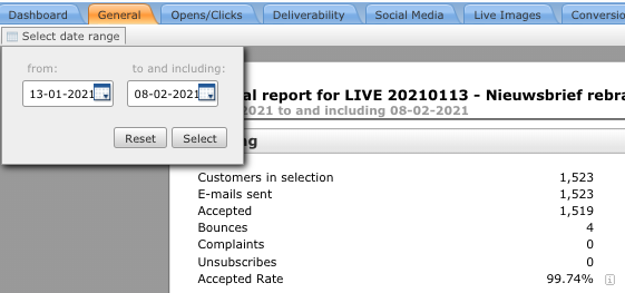
The report will display the statistics for the specified period, as well as the totals (in grey).
Opens/Clicks
This report displays the opens and clicks relative to time and provides a summary of the clickthroughs.

Opens over time
The graph displays the unique opens per hour. The ‘Confirmed Open Ratio’ pie chart on the right displays the totals, with every contact only counted once.
Clicks over time
The graph displays the unique clicks per hour. These unique clicks are grouped by contact and link. The ‘Click Through Rate (CTR)’ pie chart on the right displays the totals, with every contact only counted once.
Operating systems
The graph displays the operating system of the contact that has opened the e-mail. Every operating system is only counted once per contact. In the outer ring, a distinction is made between operating systems on desktops and on mobile phones.
Browsers
The graph displays the browser used by the contact to click on a link. Every browser is only counted once per contact. In the outer ring, a distinction is made between browsers on desktops and on mobile phones.
Clickthroughs
URL: The link corresponding to the clickthrough.
Click To Open (CTO): The bar indicates how many contacts, having received the e-mail, have also clicked in it.
Customers: The number of contacts that have clicked on the link.
Clicks: The total number of clicks on the link.
Popularity: The percentage of unique clicks on the specific link in relation to the total number of unique clicks.
Deliverability
This report provides information about deliveries, bounces, top and problem domains, and complaints.

Sent e-mails
Accepted: The number of e-mails delivered successfully.
Bounced: The number of e-mails that could not be delivered.
Bounces
This graph provides a summary of the bounces, grouped according to bounce category. We use the following bounce categories:
- bad-configuration: messages rejected due to host configuration problems, error code 5.X.X
- bad-connection: messages bounced due to host connection problems, error code 4.X.X
- bad-domain: messages bounced due to invalid or non-existent domains, error code 5.X.X
- bad-mailbox: messages rejected due to corrupted, invalid, or non-existent addresses, error code 5.X.X
- content-related: messages rejected or blocked due to reasons related to the content of the message, error code 5.X.X
- inactive-mailbox: messages rejected due to expired, inactive, or blocked addresses, error code 5.X.X
- message-expired: messages bounced due to inability to deliver within 48 hours, error code 4.X.X
- no-answer-from-host: messages bounced due to no response following host connection, error code 4.X.X or 5.X.X
- other: messages bounced for other reasons, error code 4.X.X or 5.X.X
- policy-related: messages rejected or blocked for general policy reasons, error code 5.X.X
- protocol-errors: messages rejected due to SMTP protocol syntax or sequence errors, error code 5.X.X
- quota-issues: messages rejected or blocked due to mailbox quota problems, error code 4.X.X or 5.X.X
- relaying-issues: messages rejected or blocked due to remote mail server relaying problems, error code 5.X.X
- routing-errors: bounces due to recipient domain routing errors, error code 5.X.X
- spam-related: messages rejected or blocked for spam-related reasons, error code 5.X.X
- virus-related: messages rejected or blocked for virus-related reasons, error code 5.X.X
The outer ring indicates whether the bounce is a soft bounce (Temporary) or a hard bounce (Permanent). This information is compiled on the basis of the bounce codes returned by the domain to which the e-mail was sent. As a result, a certain bounce category (e.g. ‘quota-issues’) can be displayed in the summary as a soft bounce and hard bounce.
Top domains
This displays a list of the domains to which the most e-mails have been sent.
- Domain: The domain to which the e-mails have been sent
- Sent: The total number of e-mails sent
Accepted: The total number of e-mails received
Accept ratio: The percentage of e-mails received
Problem domains
This displays a list of the domains from which the most e-mails have bounced.
- Domain: The domain to which the e-mails have been sent
Sent: The total number of e-mails sent
Bounced: The total number of e-mails that have bounced
- Bounce ratio: The percentage of e-mails that have bounced
Complaints
This graph provides a summary of the complaints, grouped according to feedback loop. If the complaint does not come in via a feedback loop, the domain is displayed. Complaints are e-mails marked as spam by the recipient.
Conversion
![]()
This tab displays a summary of the conversion achieved, based on the specified terms.
Conversion counts: The number of times that a specific term from the e-mail has been measured.
Total: The total conversion of the specified term (e.g. total sale amount or total number of products).
Average per conversion: The ‘Total’ divided by the number of ‘conversions’.
Per click: The ‘Total’ divided by the number of ‘Unique clicks’ (see General tab in report).
Per open: The ‘Total’ divided by the number of ‘Opens’ (see General tab in report).
Per e-mail: The ‘Total’ divided by the number of ‘Sent e-mails’ (note: not based on accepted e-mails).
Social Media

The graph at the top left displays the percentage of clicks on links shared on Facebook and Twitter. For every share button, the table on the right displays the number of clicks on the shared links.
Information about the hashtags is displayed below the button summary. The graph on the left displays the number of tweets about the various hashtags. These numbers are also mentioned on the right. The potential reach is also illustrated. This reach is based on the number of followers of the persons who have used the hashtag (contacts and non-contacts).
A timeline, featuring the number of tweets with the used hashtags over a period of time, is displayed at the bottom of the page. The six most popular tweets are displayed, while the hashtags are accumulated over a period of 30 days.
Visual Clicks
In this tab, content labels are used to illustrate how often a specific link is clicked. The links in the content itself are examined, as well as the links in image maps and blocks.
For every link, the number of contacts that have clicked on the link (Unique Clicks) is displayed in the label. Hover your mouse over the label to display extra information about the link. In addition to the unique clicks, the total number of clicks and the popularity of the link will be displayed. The popularity looks at the unique clicks on the relevant link relative to the total number of unique clicks.